Yeah! So while the first logo was good, it did’t really define me and was more of a designing software output
So I sat down and introspected a little (DO NOT RECOMMEND). I thought to put my MBA to work, checked out my Brand Management notes and voila! I knew Brand Prism is the answer, for a logo needs to be an expression of the creator as well as the viewer.
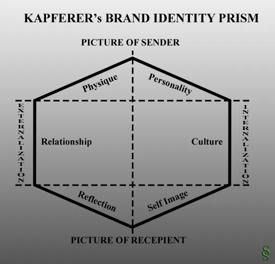
What is this Brand Prism you ask? Well its basically a set of questions a brand should ask themselves. Kapeferer summarized them in this diagram below:

I am going to explain this bit one by one and how I came up with the design of my logo
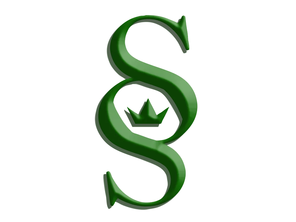
- Physique: What is my physical external image? – Fit, Average looking, but quirky nature attracts attention. Hence the edges
- Personality: How do I see myself? – Assertive, Initiator, Collaborative. Hence the king like crown
- Culture: What kind of system do I base my behavior on? – Mix of various cultures but create my own set of values, hence the center of logo isn’t a perfect circle.
- Self Image: How the people who know me sees themselves? – Optimistic, Innovative, Learners, hence open ends
- Reflection: Whats my ideal customer? – Team players, open minded, hence a combination of light and dark
- Relationship: How do I interact with my customer? – Listener, Supportive, hence green color which is soothing
Also SS is the acronym for Saurabh Singh. This has been the most common moniker of mine (populated by me since I used to sign “-SS” at the end of every post)
Technical Design:
Font: Bell MT
Use Pen tool to draw the crown
Color: Royal Green (Hex: 136207)
A little bit of Bevel effect brings out the 3D look along with the Drop Shadow and Stroke mode for pixel 2.
Note: This is a combination of psychological and philosophical approach, which would require a certain level of understanding of human nature as well as reading of Fyodor Dostoevsky‘s early work like Notes from Underground.

Final Logo

Linkedin Banner

If you need any help with regards to conceptualization of your own logo, contact me here and I will help you out.


